Patch 0.11.0: Face to Face patch hero art
v0.11.0

Patch 0.11.0: Face to Face

Every battle opens on a stare-down now, and your profile is the face you bring to the fight.

This patch is about the moment before the dice fall. Every match now opens on a cinematic stare-down: two worlds split across a glowing gold seam, your commander facing theirs, the league and the rules laid out before the first blow lands. It is the loudest the start of a battle has ever been.

Around that headline, your profile got the redesign it deserved, a premium identity block and tabs that finally tell the full story of how you play. The rest of the patch is a long pass of polish: a tidier top bar, smoother chat, a ranked ladder you climb by rating, and a stack of smaller fixes across matches and packs.

New

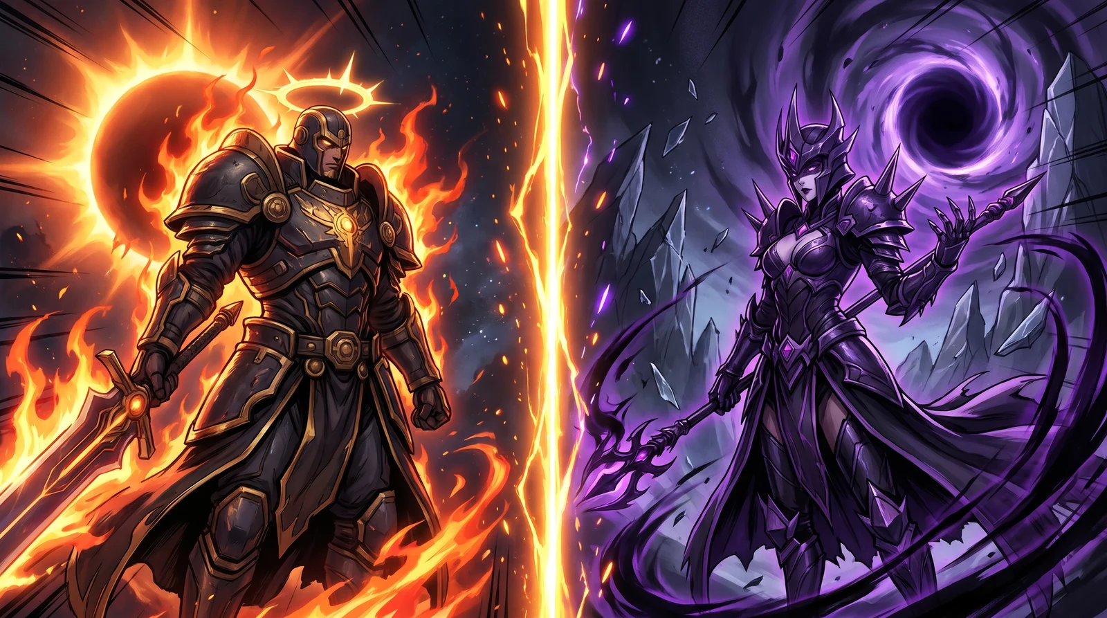
A Cinematic Pre-Battle Showdown

Every battle now opens on a full-screen showdown. The old small "match ready" card is gone, replaced by a cinematic split: each side's world clipped along a glowing gold seam, a metallic VS emblem burning where they meet, and a nameplate per side carrying the player's avatar, their commander, and their league and rating. The league, the mana cap, and the affinities in play sit across the top, the active rules across the bottom, and the whole thing tucks the page chrome away so nothing breaks the immersion. Hit Begin and the two halves slide apart into the combat board.

It plays the same way on desktop, on mobile, and on the landing-page battle showcases, with a polished gem-style nameplate and a real cinematic entrance and exit. Players who prefer calmer motion still get a clean, instant version.

Replays also gained a half-speed option. A new ½ button sits beside the existing speed controls, so you can drop any battle into slow motion and read the combat blow by blow.

Improved

The Player Profile, Redesigned

Your profile is now the gem of the page. The hero up top is a premium identity block: an affinity-tinted avatar ring, your league rank dial with its tier and peak rating, your display name, title, guild, and a hot-streak chip, all riding a full-bleed cosmic backdrop. A clean four-stat strip reads your win rate, matches, streak, and collection at a glance.

The tabs below finally pull their weight. Recent Matches and the Match History tab share a premium result-first row: a victory or defeat badge, your commander's card art as the anchor, the mode and mana, and a hover-reveal jump straight to the replay. The Ranked tab gets a real chart with a proper legend, working hover tooltips, a rating-over-time line per league family, and league boxes that finally line up at equal height. Card Usage, Affinities, and the Brawl tab are all populated now, with your most-played and signature cards, your element split and win rate per affinity, and your gladiator usage and win rate by fray.

Each tab is its own shareable link now, so you can point someone straight at your Ranked page or your Brawl record. Collection moved up to a top-level link in the header. And the whole page loads noticeably faster.

A Tidier Top Bar

The top navigation got cleaned up. The signed-in account menu is sorted into clear groups, and features that are not open during the closed alpha no longer clutter it. Brawl access folded into the Guilds dropdown, where a quick link drops you onto your active brawl and a condensed standings leaderboard shows how the tier is shaping up. The crossed-swords indicator that used to crowd the bar is gone, and the nav no longer overflows or clips items at any screen width.

Climb Your League by Rating

Ranked tiers now move with your rating. A 1200-rated Champion shows as Champion I instead of being pinned to Champion V, so your tier finally reflects how you actually play. Collection Power only decides which family you can ENTER, bronze, silver, gold, or champion, and never holds you back within a family once you are in it. And if your collection ever dips below a family's entry bar, you settle into the highest family you can still play rather than dropping all the way to bronze.

More Chat Polish

Chat got another round of fixes on the dock. Message requests now open right inside the dock with a live count that ticks up and down on its own, so you handle them without leaving the conversation. The dock panel is bigger, timestamps sit cleanly and stop colliding with names, and long messages no longer scroll sideways.

You can reply to anyone's message now, not just your own, and reactions update live beside the sender's name with a hover list of exactly who reacted. The moderator menu on guild messages also stops hiding behind the dock.

The Draft Picker Loads Faster

Opening the draft picker is quicker. The card grid that fills when you start a draft now renders about twice as fast on a warm load, so jumping in to build a team feels snappier and you spend less time waiting on the grid.

Footer Brand Icons and a Product Hunt Link

The footer now wears the real Discord and Hive brand marks instead of the old hand-drawn icons (the Hive one used to read as a generic lumpy hexagon), and we added a link to our Product Hunt page beside them.

Fixed

Smoother Custom Matches

Cleaned up the run from queueing a custom match to watching the replay. The in-game banner now correctly calls a custom match "custom" instead of labelling it ranked. The notification you get when a match finishes is clickable again and takes you straight to the replay. And the "Preparing your battle" screen now sends you into the replay on its own the moment combat resolves, instead of leaving you stranded on the loading screen.

League Badges Show the Right Art

Fixed the league art across the ranked screens. The family-level league pickers, including the season-end tournament picker, now show the proper family medallion instead of a tier badge stamped with a "V", and the off-style Gold league badge was repainted to match the muted look of the rest of the set.

Pack Page Polish

Two small fixes on the pack pages. The Gladius pack drop-rate pills no longer look clickable when they are only there to inform you, and the Your Packs heading no longer leaves its final word stranded alone on its own line.

There is more presentation polish on the way, and the next round of features is already in the works. Thanks for playing the alpha and for sending us your replays.